Welcome, to this beginner-friendly mobile SEO guide where you’ll learn, what’s Mobile SEO? Why does it matter? What and how to improve? How Mobile SEO affects your sales, traffic, and overall brand experience?
So, without further ado, let’s start.
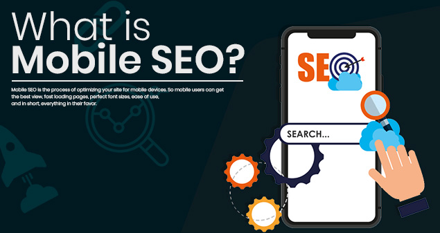
What is Mobile SEO? A Guide for Beginners!
Mobile SEO is the process of optimizing your site for mobile devices. So mobile users can get the best view, fast loading pages, perfect font sizes, ease of use, and in short, everything in their favor.
Mobile SEO makes sure that each mobile visitor on your site gets the best experience. That will lead them to spend more time on your website, and resultantly, more sales and revenue for you.
Alright, but how can you improve your site for Mobile-SEO?
Why is Mobile SEO Important?
Doing proper mobile SEO for your site is absolutely critical. If your website lacks proper mobile SEO practices, you’re missing out on a lot of traffic and sales.
Let’s take a look at some of the statistics that show why mobile SEO is important: Because numbers don’t lie.
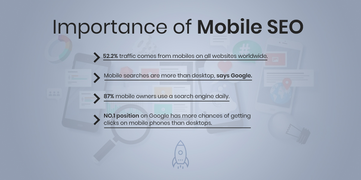
52.2% traffic comes from mobiles on all websites worldwide.
Mobile searches are increasing rapidly. More and more people are using only mobile devices to search for their desired questions, products, or services. Imagine if half of your target audience is searching on mobile phones, but your website isn’t optimized for them – you’re losing half of your sales and revenue. This is the reason your website should be optimized for all mobile devices.
Mobile searches are more than desktop, says Google.
Google, the search engine god itself, reveals in a study that there are overall more mobile searches than desktops. That totally makes sense as mobile devices are getting more powerful, and convenient than ever. People no longer feel the need to sit on their laptop, or computer, boot it, connect the Wi-Fi network, open the browser, and then make a search. Everything is getting super-fast, and smoother. So, you need to make sure your website is also super-fast, and user-friendly for those mobile searchers.
This totally makes sense – mobile phones are smaller in size. Therefore, only the first 4-5 search results are visible on the screen at a time. So, if you manage to take your website on the #1 position over a keyword, you’ve more chances of getting visitors on your website. But, once they visit, you must give them their desired answer, product, or service – otherwise, they’ll leave your website instantly, doing more harm than good.
87% mobile owners use a search engine daily.
This number is absolutely crazy – billions of people use a search engine every single day on mobile phones. That clearly suggests that there are more mobile searches than desktops – but this amount of traffic can get wasted if your website is not even optimized for mobile users.
There are dozens of more stats that prove why mobile SEO is critical in 2021-2022 and beyond. So, if you’re an online business owner of any kind, but your website lacks all the critical mobile user-friendly elements, you’re missing out on almost half of more traffic and more money. For professional help, contact our Mobile SEO strategist now for free to boost your traffic, sales, and revenue.
Guide: Easy & Free Way to check if Your Website is Mobile-Friendly.

While there are expensive tools and SEO agencies that charge you a good amount, there’s a free way as well. Good thing, it’s provided by Google.
All you need to do is to visit the mobile-friendly test Google’s page, paste your website’s URL, click ‘Test URL’, and Google will tell you whether your website is mobile-friendly.
It’s that simple.
But, what if the result shows your website is not optimized for mobile users?
What to do then? How can you improve your website’s mobile SEO?
Well, that’s exactly what this guide is exactly about.
Here are 5 ways to optimize your website for mobile users:
5 Sure-Fire Ways You to Make Your Website Mobile-Friendly.
1. Make it faster-loading

Visitors want the desired information loaded within seconds. If there’s a few seconds delay, they leave instantly – because they’ve a ton of more websites where they can get their desired answers. Then why would they wait for a website to load for 10 – 15 seconds?
In fact, a study reveals the first 5 seconds make the biggest impact on sales. And 70% of customers admit that page loading speed impacts their buying decision.
But, how do you know where to improve, and how to improve – to make your pages load faster?
Well, here’s how you’ll know what to improve:
Visit Google’s page speed insight page, paste your website’s URL, and click ‘Analyze’ to get the detailed report. Not only the report, but Google will also give the solutions to improve your site speed.
But, that’s where it can get tricky. You’ll either need to learn coding, or full scale SEO skills to get the work done. That’s a whole new chapter, a whole new story – maybe that’s a guide for another day.
For today, a quick fix is to hire an SEO agency to help you improve your page speed.
2. Deliver the ‘bestest’ user experience

Faster loading speed also comes under the category of delivering the best user experience. Since faster loading speed is a major concern, that’s why we discussed that separately.
But, there’s a lot more to user experience, which you might not even notice. Here’s where you can improve:
- Design according to mobile devices: As mobile devices are smaller, and most users only use ‘thumb’ to scroll up and down, click, or swipe, you need to make sure your website is ‘thumb-friendly’. Everything should be in reach to the thumb. That will make navigation easier.
- Clear CTAs for mobile devices: CTAs or call-to-actions are the buttons where you say ‘Buy Now’, ‘Call Now’, or anything else to ask your visitors to do some sort of action. CTAs should be clear, should be at the right place, and should be sized according to mobile devices.
- Ideal font size: This is where it gets tricky – you need to make sure you choose the font size that’s ideal for mobile users. Nor too big, neither too small. Usually 14-15pt works best but choose according to your industry, website design, and target audience.
- Keep the content mobile-friendly: What this means is that you need to make sure the paragraphs in the content are smaller, two to three liners. That way it’s always easier for mobile users to navigate, and get along with the content. Besides, big blocks of text scare away the readers.
- Use bullet points: All the important or key point elements should be in bullets. Because desktops have way larger screens, it’s much easier for them to simply scroll with their mouse, and see ‘all at once’. But, that’s not the case with mobile users. Simple, easy to read bullet points save users time, and they can easily find their desired answer.
- The Menu: Specifically for mobile users, it can be problematic. Let me explain: Make sure it’s visible right in front so mobile users can easily access it, and they won’t have to scroll all the way down to find your ‘contact us’ page. Also, if it’s drop-down, make it super-fast, as some mobiles might have less RAM power, or for whatever reason, the experience shouldn’t be annoying.
3. Responsive design is crucial
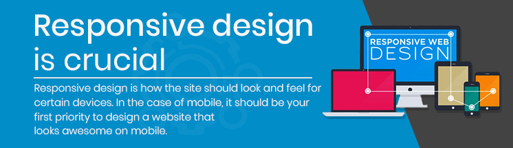
Responsive design is how the site should look and feel for certain devices. In the case of mobile, it should be your first priority to design a website that looks awesome on mobile.
For example, to make it responsive, make the layout design according to mobile-screen size or change the orientation of certain elements like image sizes, icon sizes, or buttons to fit according to mobile screens. What that will do is, it will keep the visitors stay on your website to access information easily. Resultantly, you’re the one who’ll get more traffic engagement, sales, and revenue.
Let’s take a real-life scenario to understand this topic a little better.
Pop-ups: Have you ever visited a website on your mobile device, and just a few seconds after entering, a big block of cool, flashy text, shows up and asks for your email? Yes, that’s a pop-up, and it might be ruining your business. Let me explain.
Pop-ups are a great way to gather leads, i.e. their email address by providing visitors a free value-filled resource, like an Ebook in most cases. But, if done wrong, they can be the worst nightmare for you.
See, mobile-screens are tiny, about 6 inches mostly. If a mobile visitor is spending a good amount of time on your website, that means he/she loves the experience on your site. He/she is taking the desired information that he needs. But, when a giant pop-up comes out, covering their entire screens, it can be annoying. And not once or twice, most online business owners repeat the same pop-ups a lot of time for their mobile users. What’s even troubling is that, the cross sign that gives the users the choice to close the pop-up tab, is either way too tiny, hidden in the corner, or worse, doesn’t even exist. So, users will have to wait for several seconds to finally get relief from that pop-up asking for their emails.
You cannot be doing that. Google knows how users react and engage with those pop-ups, and if they’re annoying your users, you might get suppressed in ranking, losing the potential traffic, sales, and revenue.
Do it right by giving the users the choice of closing them, make them small for the visitors, and don’t repeat them too often.
4. Local SEO can increase your mobile traffic

‘Near me’ type of searches have grown three times more in just a few years on mobile searches, study shows.
People are searching for example, ‘mobile repair shop near me’, or ‘best coffee shop near me’. And these types of searches are mostly done on mobile phones…because think about it: you’re in the market, buying some grocery for your home, and you need that low-fat yogurt, but you can’t find it physically. What will you do? You can’t go back to your home, open your laptop, or boot your PC, and then on Google Chrome, type; low fat yogurt near me.
Your best guess would be to open your mobile phone, standing there, just make a search, to see if you can find the product you’re looking for.
Now, local SEO is a set of unique tactics like targeting the most specific queries of the target audience. It can be hard, especially if you don’t know the skills required, so the best way is to hire an SEO agency for local SEO services in your city.
5. Create a separate URL for mobile users
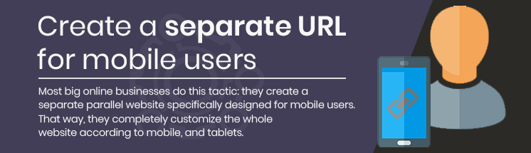
Most big online businesses do this tactic: they create a separate parallel website specifically designed for mobile users. That way, they completely customize the whole website according to mobile, and tablets. This can be hugely beneficial, but managing the two different websites might require extra effort. Especially, the technicalities involved in creating a separate mobile URL are also a major issue for most online business owners. But, the right SEO agency can help.
An example of a separate mobile URL would be like:
www.mywebsite.com (for desktop)
m.mywebsite.com or mywebsite.com/mobile (for mobile users)
Conclusion
So, this is it. We hope you got the expected value out of this guide.
The best way is to deliver a great user experience by answering the questions of your target audience: because all can go in vain if you don’t have the content that helps your users.
Mobile SEO can be tricky. But, if you’re stuck somewhere in optimizing your site for mobile users, or for anything, ORM has the professional support. With over 7 years in the business, driving thousands of revenue for our clients, we can also help You get more organic traffic, sales, and revenue in the promised time. Call now for a free consultation.
Nizam Ud Deen, author of The Local SEO Cosmos, is a seasoned SEO Observer and digital marketing consultant with close to a decade of experience. Based in Multan, Pakistan, he is the founder and SEO Lead Consultant at ORM Digital Solutions, an exclusive consultancy specializing in advanced SEO and digital strategies.
In The Local SEO Cosmos, Nizam Ud Deen blends his expertise with actionable insights, offering a comprehensive guide for businesses to thrive in local search rankings. With a passion for empowering others, he also trains aspiring professionals through initiatives like the National Freelance Training Program (NFTP) and shares free educational content via his blog and YouTube channel. His mission is to help businesses grow while giving back to the community through his knowledge and experience.